Mario and Harry were already deeply involved in the organic food trade before setting their sights on natural salts. Their country, Greece, is the cradle of the Mediterranean Diet, home to the biggest variety of herbs and the source of rare sea salts. Their destination is the ever growing market of natural salts in Europe and America.
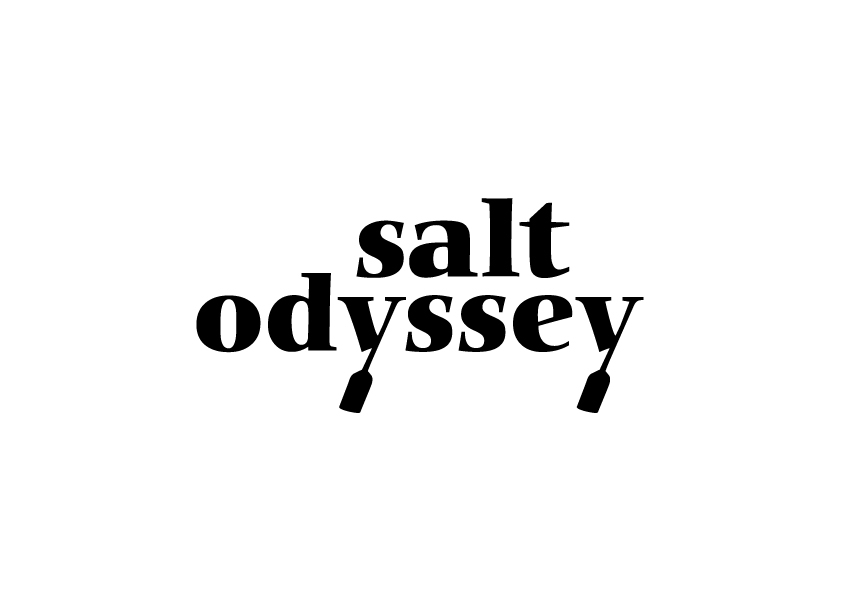
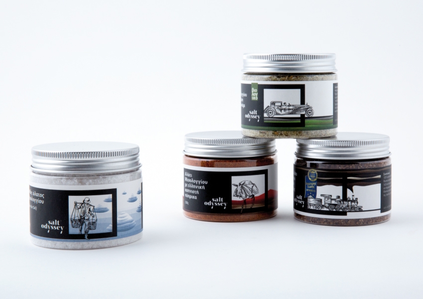
To start with, blending the aromas of Greek herbs with a prime sea salt - harvested from a wildlife habitat - seemed only natural; as natural as the brand Colibri designed for them: Salt Odyssey. The logotype is based on a modern serif type with a contrast of thick and thin lines. The descenders of the Y's replicate the heavy verticals to form the oars of an old vessel. The word "salt" acts like a sail.
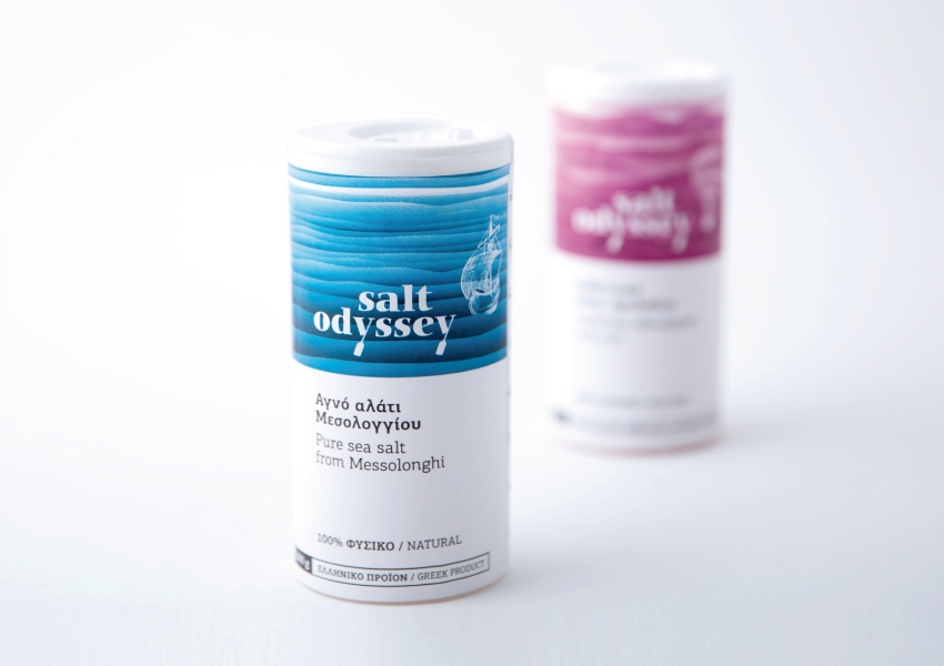
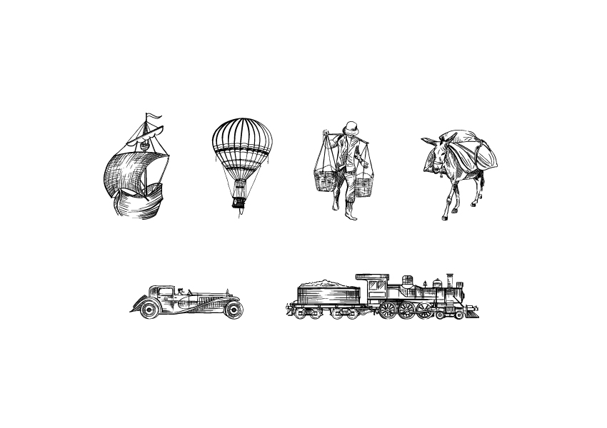
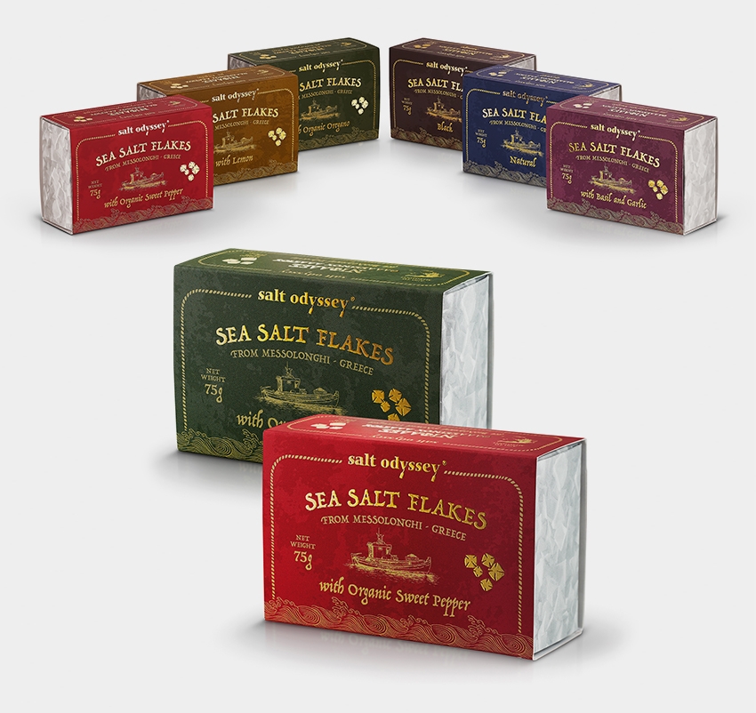
And they set sail for the markets of the world carrying a range of salt blends, the original Himalayan Rock Salt, a Fleur de Sel and other top quality finishing salts in jars, shakers and mills.
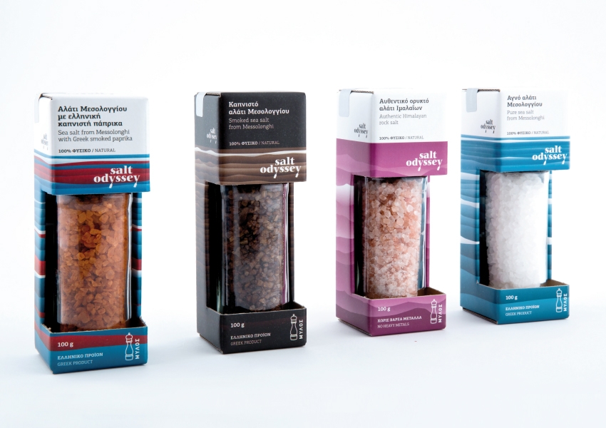
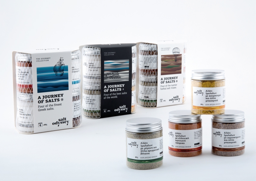
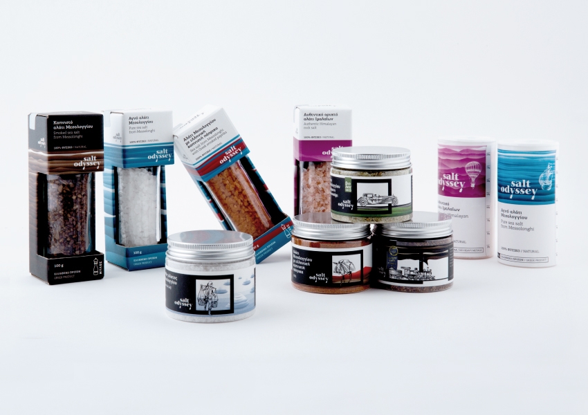
For the mills' packaging, Colibri designed a carton container that protects the glass mill, shows the product and creates ample space for branding elements, labels, nutrition data and other mandatory information. For the assortments, besides shaping the open carton holder, Colibri added a light "fishing" net holding two pairs of clear containers in position. The wavy lines form the background "sea" for the logo and their colour signify the product - from dark brown to ocher for the Salt Odyssey's signature Smoked Messolonghi Salt, from deep purple to pink for the Himalayan rock salt.
The new brand and the product series of Salt Odyssey were first presented at Anuga 2015 and made both the client and Colibri happy with the result of their extensive background research and pleasant voyage over the design process.