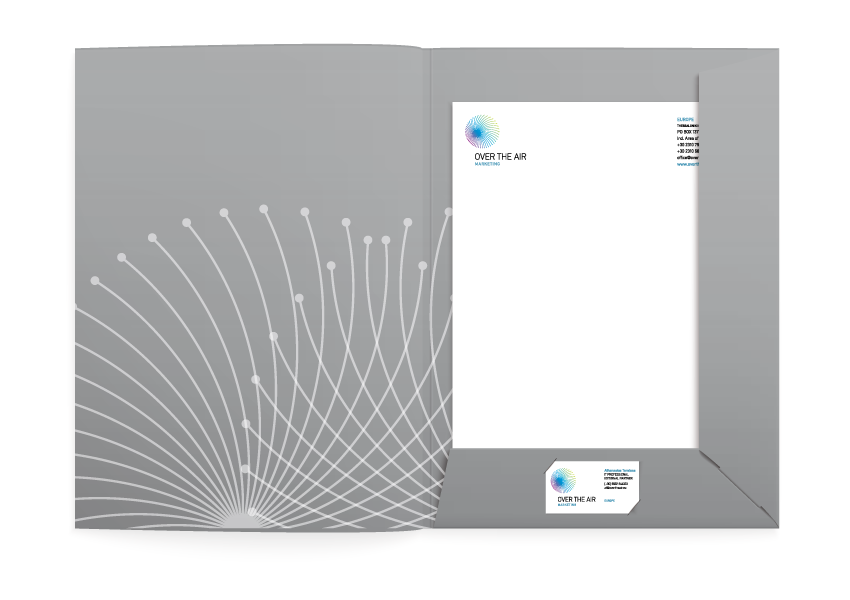
In April of 2010 Colibri was assigned the design of the visual identity for a new direct marketing company.
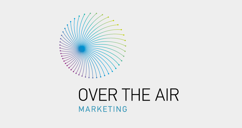
The branding strategy followed was a mutual decision between ourselves and the client. The basic aim was to create a modern logotype, almost ethereal, modest and at the same time targeted to the new media the company will be using for its programmes.
To that effect, we opted for “Over the Air Marketing”. Both logotype and emblem -a circle with colourful rays - visualize the outgoing, diverse communication forms and the efectiveness used in bellow the line marketing strategies. To maintain the balance between playful and ethereal emblem and logotype we chose a modest and equal thickness font.
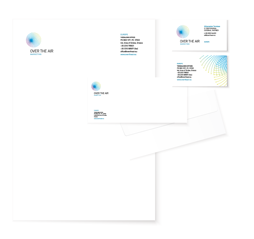
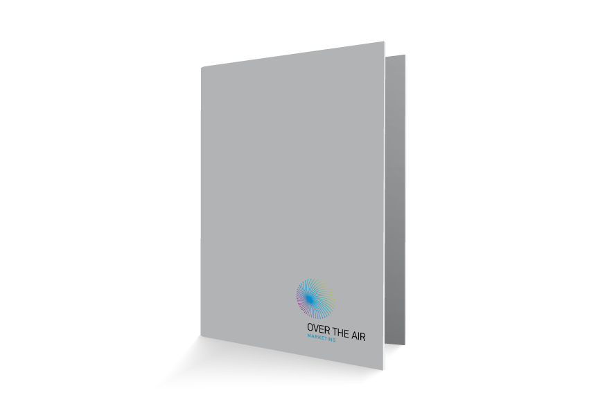
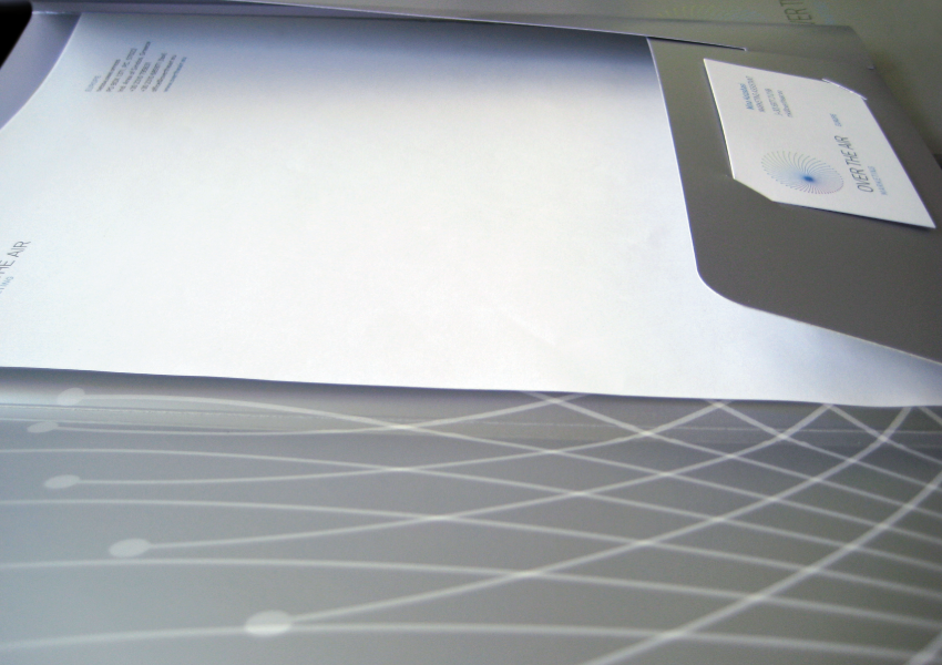
The project also includes name proposals, extensive presentations and a series of design applications such as business cards, letterheads, envelopes, “with compliments” slips, folders, stickers e.t.c.
