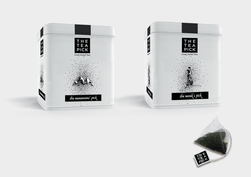
What is a brand if not a name, chosen or fabricated to become part of our vocabulary as a unique word signifying a particular product or service? And what name could be more typical for a series of hand picked herbal teas than THE TEAPICK?
The client’s choice of the brand name meant also a choice for the products strategy: bagged for convenience, international in distribution, young at heart, creative blends of herbal teas. Our work for the brand logo was in line with this strategy and contemporary design: a clear, straightforward message: The Pick(selection) of Tea(s) – The (hand)Pick(ed) Tea.
The actual design is ridiculously typical -we just had to visually utter the word in black and white. In this way we made sure it will be prominently there on carton boxes, tubes or jars; even on the 1X1cm teabag paper handle. The black rectangular shape offers itself to a wide range of visual styles for the sub-brands and labels. It allows for illustrations with vivid colours or subtle pointillism.
It also stands out on the shelf for its strong differentiation -the great majority of competitor brands -especially the ones claiming “all natural” or “organic”- opt for colour and elegance. Not this one, for sure!


