The two elements that our design approach took were to communicate experience, tradition and expertise in knowing exactly how to handle and craft savory pies, but also a modern, fresh, energetic, one-step-above-the-rest approach, that would represent this new generation of pie makers, now arriving at their moment to be the key protagonists in the family business.
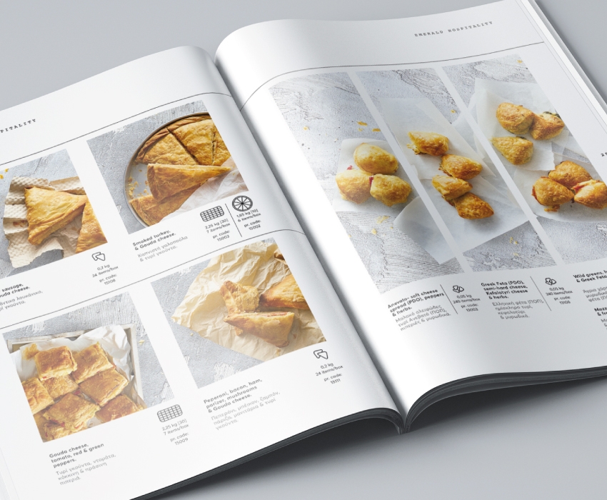
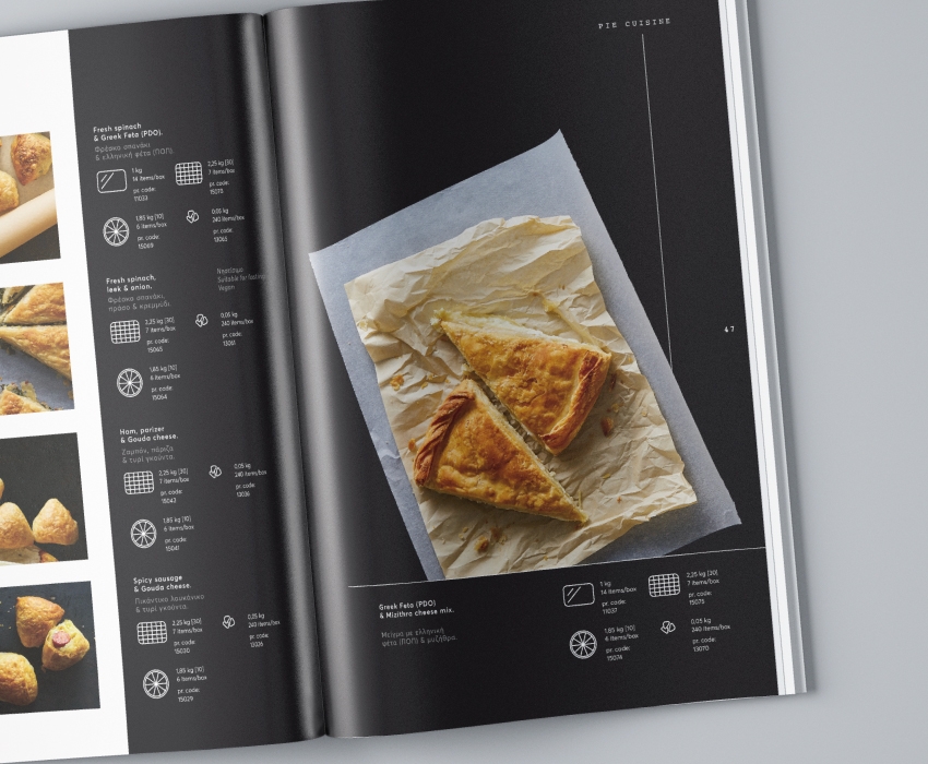
These two elements were combined using a very clean spacious and minimal design layout balanced with textural elements, in particular the grease proof paper and a focus on the phyllo crusts. Additionally, this combination is also emphasised by use of two fonts; one clean and modern and the other an instantly recognisable retro font.
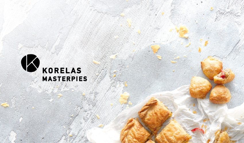
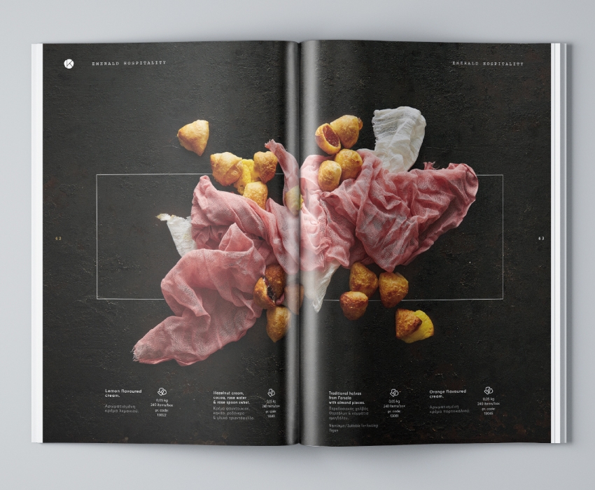
Another significant and apparent design feature is the out-of-the-box effect of having the product on one edge extend beyond the border. This resembles their culinary approach to push the boundaries of normality, not only creating high quality products, but creating brand-new, never previously made pie flavour combinations.
Within the catalogue itself we categorised their pies into 11 identifiable sizes, finding suitable names for each size, designing pictograms to represent each size and then applying those sizes across all their product lines.